
Traditionally, Dynamics 365 charts had to be built in advance to suit possible future use, but what if you could generate custom charts yourself in seconds?
For years, Dynamics 365 has allowed users and administrators to create charts and dashboards to turn plain rows of data into eye-catching visuals, providing a better overview of large datasets. For system charts (those that everyone can access), these had to be built in advance, and for personal charts, these took time for a user to create and involved a degree of technical skill. However, with Copilot’s new Visualize feature, currently in preview, new charts can be created in seconds and easily copied for use in your presentations.
Charts generated by Copilot can easily customised to use different criteria or to use a different visual. The following visuals are currently available :
- Pie Chart
- Doughnut Chart
- Column Chart, including Stacked and Clustered variants
- Bar Chart, including Stacked and Clustered variants
- Line Chart
Once you’re happy with the chart, you can click the Copy button to copy the chart to your clipboard to then paste into your documents and presentations.
How do I enable the Visualize option?
As the feature is currently in preview, you may not immediately see the option to visualise your data in your own environments. However, this setting can be enabled manually via the Power Platform Admin Center:
- Visit https://admin.powerplatform.microsoft.com/
- Find the environment for which you want to enable Visualize
- In Settings>Features, scroll down to
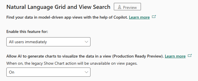
The Natural Language Grid (which allows you to interrogate your data views by simply typing what you want to see) needs to be enabled, along with the Allow AI to generate charts to visualize the data in a view option for the Visualize option to present itself in your model-driven apps.
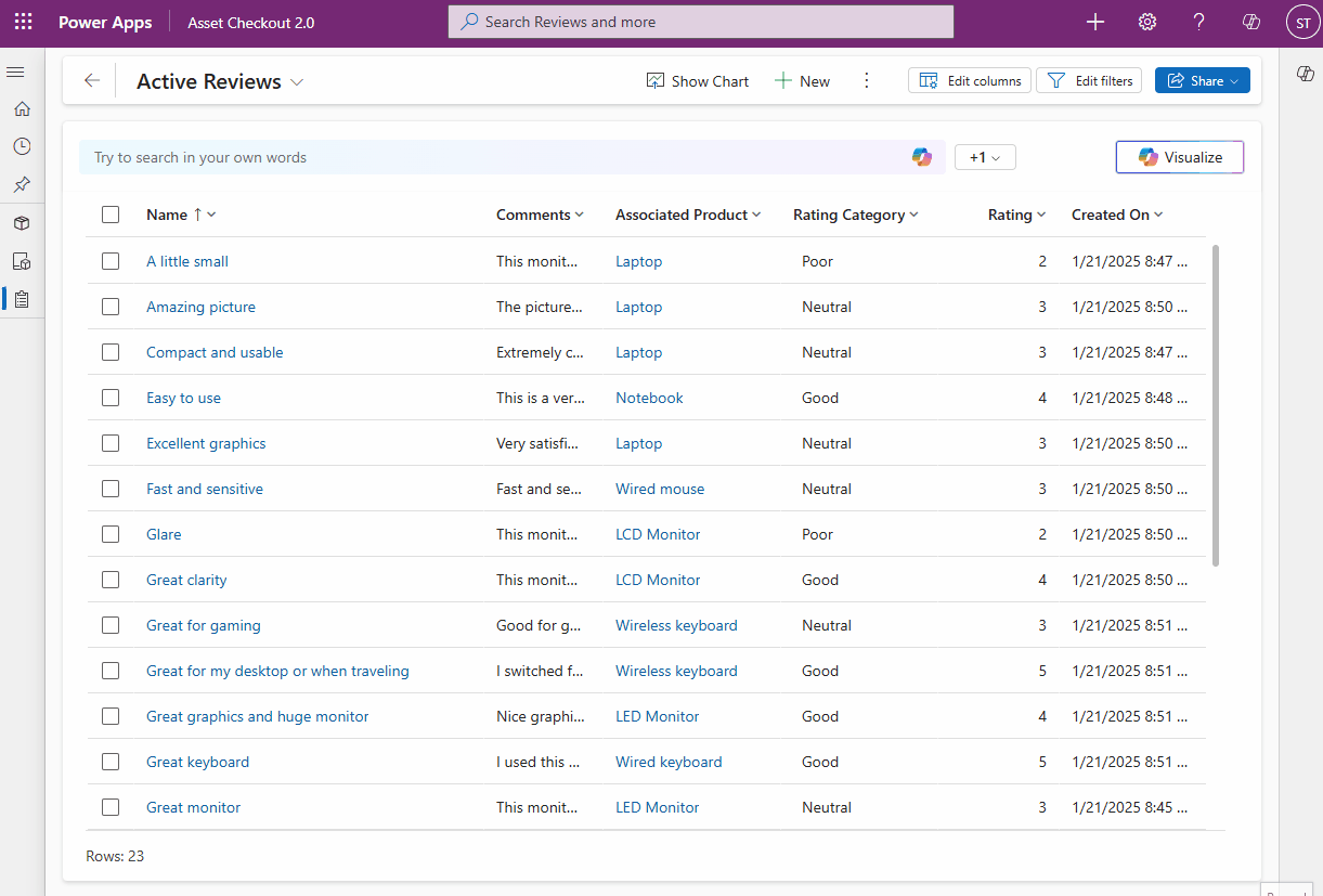
Once enabled, simply navigate to any of your table views in a model-driven app and you should see the new Natural Language Grid and Visualize button.
Summary
It’s interesting to see how Microsoft are applying their Copilot technologies to different aspects of Dynamics 365 and the Power Platform, and this new ability to quickly visualise data should prove useful for any type of user. If you are an existing client of Strategy 365 and want to discuss enabling the feature for your own environments, please get in touch with one of our experts today.
